Basics Of Typography: Choosing Fonts For Your Brand

Choosing fonts for your brand can feel deceptively simple… until you realize just how many options there are (and how much of a difference they make). Whether you're DIY-ing your brand or just want to elevate your visual identity, understanding the basics of typography will help you choose fonts that not only look great but also reflect your brand personality.
Let’s break down the key concepts, font types, and best practices so you can feel confident in your brand font choices.
What Is Typography, Anyway?
Typography is the art and technique of arranging type — in other words, how your letters look and how they’re used to communicate. Fonts are a huge part of visual branding and help shape how your audience perceives you at a glance.
Your brand fonts should:
Feel aligned with your brand voice and values
Be easy to read across different platforms
Work together in a cohesive and flexible system
Not sure what your brand voice actually is? Start with this free 5-minute Brand Audit to get clearer on your direction.
Font Categories 101: Understanding Your Options
There are four primary font categories you’ll see in branding. Each one communicates something different:
Serif Fonts
Serif fonts have little “feet” or strokes at the end of each letter. They tend to feel traditional, classic, and trustworthy. Think: Times New Roman, Playfair Display, Georgia
Great for: More established or luxury brands

Sans Serif Fonts
Sans serif fonts are clean and modern, with no extra strokes. They feel approachable, minimal, and versatile. Think: Helvetica, Poppins, Open Sans
Great for: Creative entrepreneurs, online service providers, tech brands

Script & Display Fonts
Script and display fonts are best used sparingly to add character and flair. Script fonts mimic cursive handwriting and can feel warm, personal, or elegant. Think: Pacifico, Great Vibes, Allura Display fonts are bold, highly stylized, and designed to grab attention. Think: Bebas Neue, Abril Fatface, Playbill
These are great for logos, quotes, and occasional headlines — but not ideal for long paragraphs or body text.

Steps to Choosing Fonts for Your Brand
So now that you know your font types, here’s how to actually choose fonts for your brand identity.
1. Start with Strategy
As with everything in branding, don’t start with what looks good — start with what feels aligned. What’s the vibe you want to communicate? Is your brand bold and modern? Soft and warm? Refined and editorial?
Use those adjectives to guide your font selection process.
2. Prioritize Function First
Your fonts should be legible and work well at different sizes (on mobile, social graphics, email headers, etc.). Avoid overly decorative fonts for anything beyond a logo or headline.
3. Test Your Font Pairings
Choose a heading font and a body font that complement each other without competing. A classic pairing is a serif heading with a sans serif body — but play around and see what feels right for your brand.
Want to try a few combinations? Tools like Google Fonts and Canva’s Font Pairing Generator make this easy.
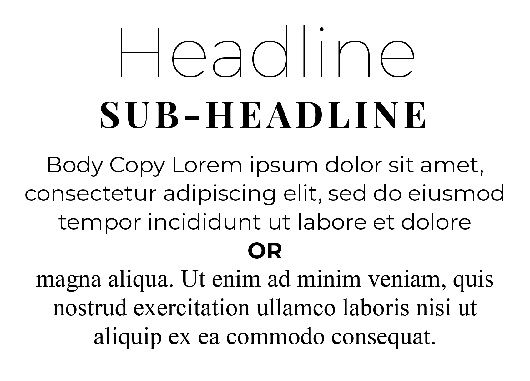
Perfect Font Pairing Examples
Here are a few go-to brand font pairings that almost always work well together:
Option 1:
Headline: Script
Sub-Head: Sans-Serif
Body Copy: Serif (“sleek/modern”)
or Sans-Serif (“classic/traditional”)

Option 2:
Headline: Sans-Serif
Sub-Head: Serif, Sans-Serif, or Script
Body Copy: Serif (“sleek/modern”)
or Sans-Serif (“classic/traditional”)
Option 3:
Headline: Serif
Sub-Head: Serif or Sans-Serif
Body Copy: Serif (“sleek/modern”)
or Sans-Serif (“classic/traditional”)

Pairing fonts can get a little tricky even when you have the best of intentions. To be safe, keep it to a maximum of 2-3 different fonts and always double check that the fonts you’re selecting are easily readable EVERYWHERE they show up.
Typography Tools & Resources
Looking for more help choosing fonts for your brand? Here are a few tools I recommend for exploring font combinations, pairing suggestions, and implementation:
Google Fonts: Free, web-safe font library
Canva Font Combinations: Plug in your favorite font and get pairing suggestions
Fontjoy: AI-powered font pairing generator
Coolors: While known for colors, it's also helpful when visualizing design mockups with fonts
Typography + Brand Personality = Magic
When done right, your brand fonts should feel like an extension of your voice — not an afterthought. The right typography system brings your brand together across platforms and helps build recognition and trust with your audience.
And remember: it's okay to experiment a bit. Try different combinations, test them in mockups, and don’t be afraid to tweak if something isn’t working. That’s part of the process.
Not Sure If Your Fonts Are Working?
If you’re second-guessing your current brand fonts (or just want a second opinion), grab a free 5-minute Brand Audit and let us take a look. We’ll help you figure out what’s working and what’s ready for a refresh.